Aug 16 2019
At OakTree Apps, we are big fans of Flutter. We truly believe that Flutter has tremendous potential to disrupt the mobile market. Our reasons are multiple, and maybe we will leave that for a different post in the future.
Today, however, we shall see how to add a TabBar and a BottomNavigation to your Flutter app.
So, let’s start with what is a TabBar View and a BottomNavigationBar? The official Flutter documentation states the following:
TabBar
A material design widget that displays a horizontal row of tabs. Typically created as the AppBar.bottom part of an AppBar and in conjunction with a TabBarView. If a TabController is not provided, then a DefaultTabController ancestor must be provided instead. The tab controller’s TabController.length must equal the length of the tabs list and the length of the TabBarView.children list.
BottomNavigationBar
A material widget that’s displayed at the bottom of an app for selecting among a small number of views, typically between three and five. The bottom navigation bar consists of multiple items in the form of text labels, icons, or both, laid out on top of a piece of material. It provides quick navigation between the top-level views of an app. For larger screens, side navigation may be a better fit. A bottom navigation bar is usually used in conjunction with a Scaffold, where it is provided as the Scaffold.bottomNavigationBar argument.
Seems fairly straightforward, doesn’t it?
We initially struggled with trying to determine what is the best approach to incorporate both before eventually settling into one. So enough talking and let’s start coding.
Go ahead and create a new Flutter project. After the project has been created successfully, your main.dart would look something similar to this:
void main() => runApp(MyApp());

class MyApp extends StatelessWidget {
  // This widget is the root of your application.
  @override
  Widget build(BuildContext context) {
    return MaterialApp(
      title: 'Flutter Demo',
      theme: ThemeData(
        primarySwatch: Colors.blue,
      ),
      //new
      home: MyHomePage(title: 'Flutter Demo Home Page'),
    );
  }
}
The MyHomePage class points to a home page that will show a TabBarView and BottomNavigationBar working together. Here is what the final MyHomePage class looks like:
class MyHomePage extends StatefulWidget {

  @override
  State createState() {
    return _MyHomePage();
  }

}

class _MyHomePage extends State{
  int _selectedIndexForBottomNavigationBar = 0;
  int _selectedIndexForTabBar = 0;

  //1
  static List _listOfIconsForBottomNavigationBar = [
    Icon(Icons.directions_car),
    Icon(Icons.directions_walk),
    Icon(Icons.directions_bike),
  ];

  //2
  static List _listOfIconsForTabBar = [
    Icon(Icons.directions_boat),
    Icon(Icons.directions_bus),
    Icon(Icons.directions_railway),
  ];

  //3
  void _onItemTappedForBottomNavigationBar(int index) {
    setState(() {
      _selectedIndexForBottomNavigationBar = index;
      _selectedIndexForTabBar = 0;
    });
  }

  //4
  void _onItemTappedForTabBar(int index) {
    setState(() {
      _selectedIndexForTabBar = index+1;
      _selectedIndexForBottomNavigationBar = 0;
    });
  }

  @override
  Widget build(BuildContext context) {

    //5
    final tabBar = new TabBar(labelColor: Colors.blue,
      onTap: _onItemTappedForTabBar,
      tabs: [
        new Tab(
          text: "BOAT",
        ),
        new Tab(
          text: "BUS",
        ),
        new Tab(
          text: "RAILWAY",
        ),
      ],
    );

    //6
    return new DefaultTabController(length: 3, child: new Scaffold(
      appBar: AppBar(bottom: tabBar,backgroundColor: Colors.white, title: Text('Tabs Demo')),

      //7
      body: Center(child:_selectedIndexForTabBar == 0 ?
      _listOfIconsForBottomNavigationBar.elementAt(_selectedIndexForBottomNavigationBar):
      _listOfIconsForTabBar.elementAt(_selectedIndexForTabBar - 1)),

      bottomNavigationBar: BottomNavigationBar(
        type: BottomNavigationBarType.fixed,
        onTap: _onItemTappedForBottomNavigationBar, // this will be set when a new tab is tapped
        items: [
          BottomNavigationBarItem(
              icon: new Icon(Icons.directions_car),title: Text('CAR')),
          BottomNavigationBarItem(
              icon: new Icon(Icons.directions_walk),title: Text('WALK')),
          BottomNavigationBarItem(
              icon: Icon(Icons.directions_bike),title: Text('BIKE')),

        ],
        currentIndex: _selectedIndexForBottomNavigationBar,
      ),
    ));
  }

}
You are probably confused at this point as to what is happening in the file.

Let’s unpack the file one step at a time:
- We create a static list of icons that will be displayed when the user selects any one of the tabs from BottomNavigationBar.
- We create another static list of icons that will be displayed when the user selects any one of the tabs from TabBar. We could have reused the same list but for clarity purposes, we have two separate lists.
_onItemTappedForBottomNavigationBaris called when the user selects any tab from theBottomNavigationBar. We pass the index of the selected tab as a parameter so that we can fetch the appropriate image from the list based on the index. In this function, we reset the_selectedIndexForTabBarvariable to 0 to avoid overlap between two images._onItemTappedForTabBaris called when the user selects any tab from theTabBar. We again pass the index of the selected tab as a parameter so that we can fetch the appropriate image from the list based on the index. Similar to the previous point, we reset the_selectedIndexForBottomNavigationBarvariable to 0 to avoid overlap between two images.
You may also notice that _selectedIndexForTabBar is incremented by 1. Why is that?That is done to help the build function determine which image to display.
- We are creating the TabBar with the textColor being blue, and we are passing a list of widgets for the tabs. As you can also see, we have an onTap parameter which is assigned to
_onItemTappedForTabBar. - We create a
DefaultTabControllerto host outTabBar. Flutter requires that while creating aTabBarwe either use theDefaultTabControlleror provide our ownTabController. If neither is provided there will be a runtime exception. We are passing the length for theDefaultTabControlleras 3 to display the appropriate number of tabs. - We are using both the variables to determine what image should be displayed when the user selects a tab from either the
TabBarorBottomNavigationBar.If_selectedIndexForTabBar == 0, we tell thebuildfunction to fetch an image from the_listOfIconsForBottomNavigationBarlist and vice versa.
The final app looks something like this:
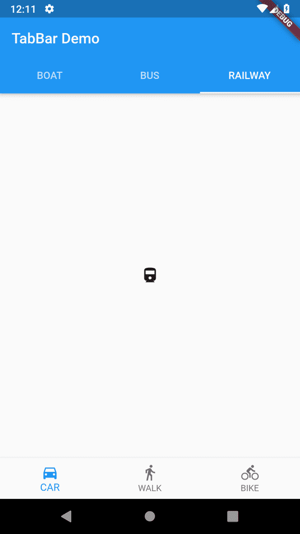
In this tutorial, we learned how to get a bottom navigation bar working together with a Tab bar.
We are a flutter app development agency. Check our website or send us an email at pk@oaktreeapps.com with your thoughts or questions.